
10 photography styles to try in ChatGPT

A product photographed under hard flash tells a different story from the same product beside a softly lit window. One feels immediate and energetic; the other feels quieter and more familiar. Neither is automatically better. It depends on what you want people to feel about the brand.
That’s what makes ChatGPT useful for exploring photographic direction. You can try different settings, lighting and compositions before committing to a route. But asking for something “cinematic” or “premium” only gets you so far. The more useful question is what those words should look like in the frame.
Below are ten approaches to try, with prompts you can adapt. We’ve used the same fictional yellow bottle throughout so you can see what changes when the art direction changes.
Give the image a job
Before writing a prompt, decide what the picture needs to do. Make a material feel desirable? Show a product fitting into everyday life? Create enough intrigue for someone to stop scrolling?
Then describe the choices that matter: the subject, its surroundings, the camera position and the light. Add the intended format and leave room for copy if the image needs to work as an advert.
For example:
Create a campaign photograph of an unbranded matte yellow reusable bottle with a black screw cap, standing on a concrete ledge in a city courtyard. Eye-level medium shot, soft daylight from the left and a quiet background. Landscape 16:9, with clear space on the right for a headline. No lettering, additional products or logos.
If you’re working with a real product, attach an approved reference and explain which details must stay unchanged. If you supply several references, give each one a purpose: this image for the lighting, that one for the composition.
1. Observational documentary
Documentary photography finds interest in an ordinary moment. The surroundings matter as much as the subject: a worn surface, the weather, something left just outside the main action.
For a brand, this can be a useful way to explore how a product belongs in someone’s life. Keep the scene specific. Adding random clutter rarely makes it feel more convincing.
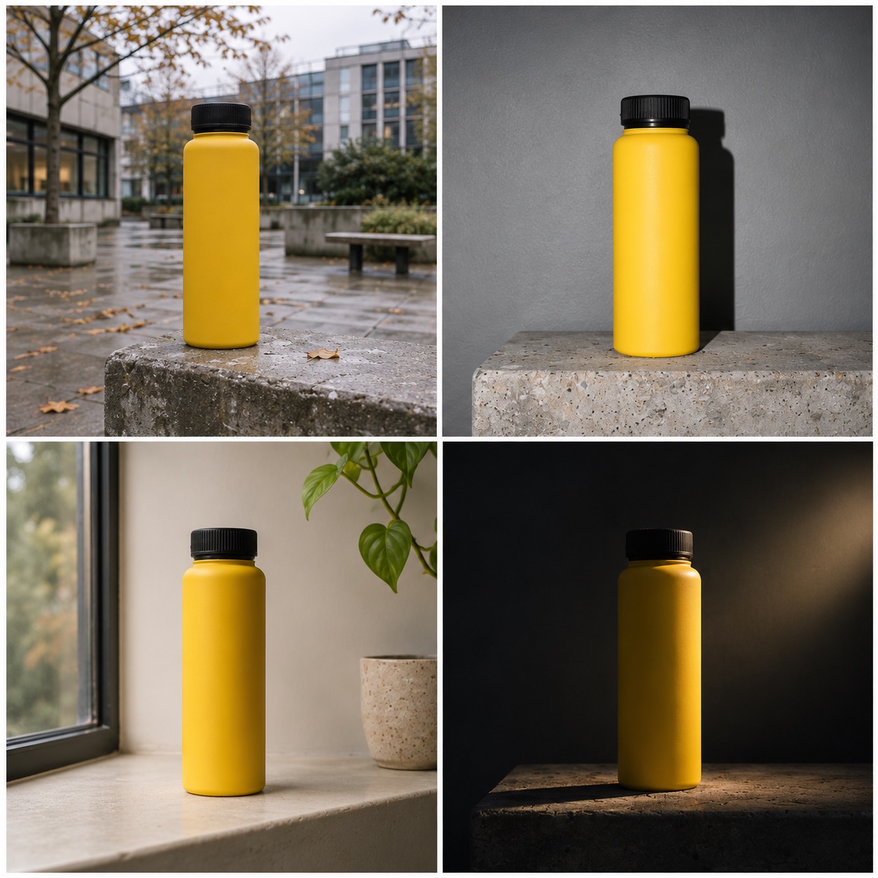
Photograph the yellow bottle on a scuffed concrete ledge in a city courtyard after light rain. Use soft overcast daylight and a wide environmental composition, with the bottle clearly visible. Restrained colour, a damp surface and a folded jacket nearby. The framing should feel casually observed.
2. Direct-flash editorial
Direct flash brings a sense of immediacy. Highlights are bright, shadows are defined and the camera feels close to the action. It can give an otherwise simple product shot the energy of an editorial photograph.
The shadow is worth describing in your prompt. Without it, the result can drift towards softer studio lighting.
Create a direct-flash editorial photograph of the yellow bottle against a plain grey courtyard wall. Hard flash close to the camera, with a short, clearly defined shadow behind the bottle. Tight framing and crisp surface detail. Keep the matte finish visible.
3. Soft daylight lifestyle
Soft daylight is familiar for a reason: it makes products feel approachable. It works well when you want someone to imagine an object in their home or daily routine.
The setting still needs some thought. “Warm and beautiful” leaves a lot undecided. A particular window, surface or time of day gives you a clearer direction.
Photograph the yellow bottle on an interior concrete window ledge overlooking a courtyard. Large, soft window light from the left, gentle shadows and warm neutral surroundings. Eye-level medium shot, with the bottle sharp and the background softly readable.
4. Low-key cinematic
Low-key lighting uses shadow to control attention. You reveal enough of the subject to make it interesting while leaving parts of the frame unexplained.
It can work for a product reveal or a more dramatic campaign idea. Just be clear about what people still need to see. A dark frame is little use if the product disappears into it.
Create a low-key photograph of the yellow bottle on a concrete plinth in a dark courtyard. A narrow light from the left reveals the bottle’s curved edge and matte surface. Let the opposite side fall into deep shadow, while keeping the cap and overall silhouette recognisable. No fog.
5. High-key product photography
Sometimes the product should do all the talking. A bright, simple studio setup gives shape, colour and construction room to stand out.
This is also a good test of restraint. A grounding shadow and clear edges often do more for the image than another layer of gloss.
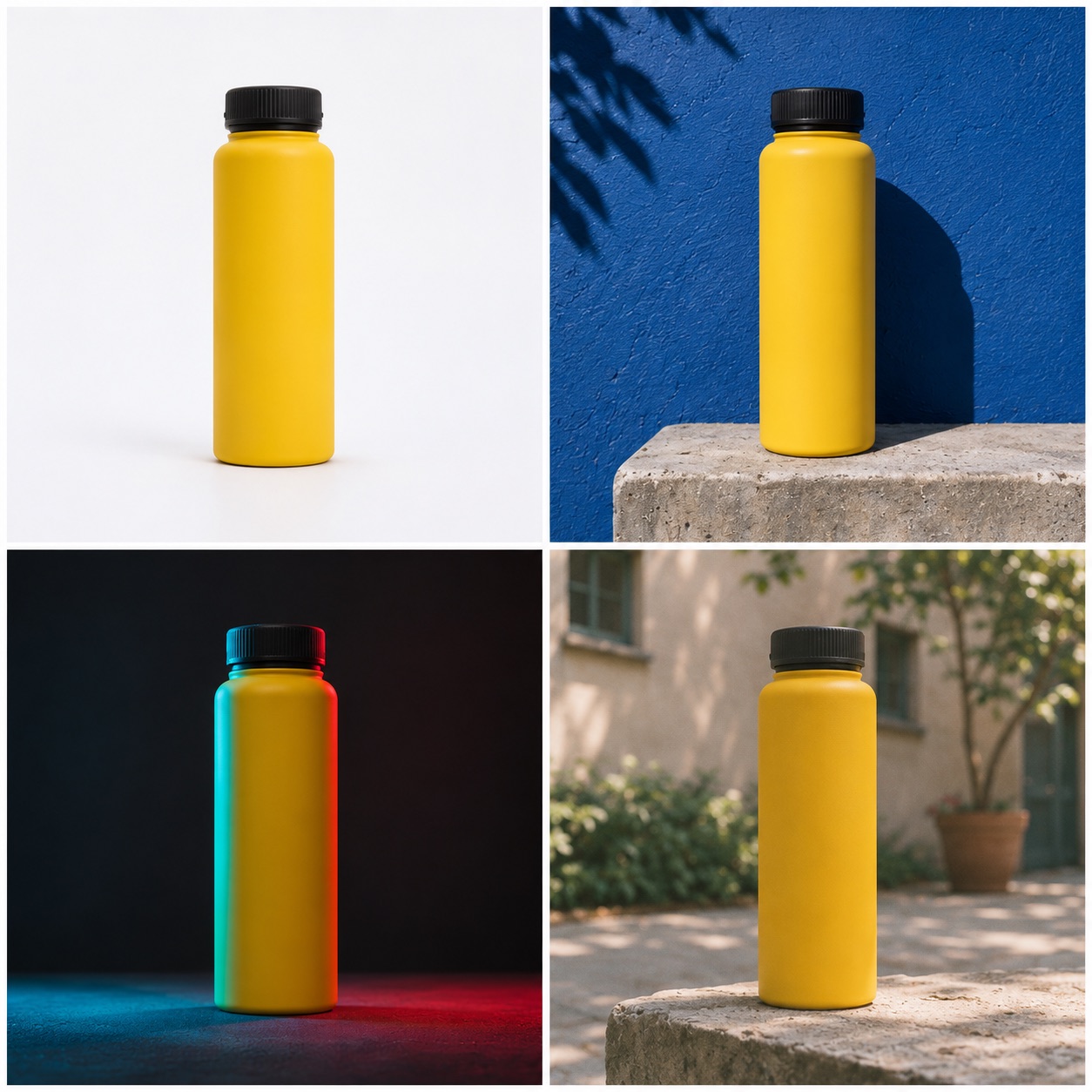
Photograph the yellow bottle upright on a seamless white studio surface. Soft, even lighting, a subtle shadow beneath it and clear separation around the edges. Straight verticals, realistic proportions and visible matte texture. No props.
6. Hard sunlight and graphic shadows
Strong sunlight turns a setting into shapes: a diagonal shadow, a block of colour, the edge of a wall. It can make a straightforward composition feel bold without adding much to the scene.
Think about the shadow as part of the layout, especially if you’re leaving space for a headline.
Photograph the yellow bottle on a concrete plinth against a cobalt-blue courtyard wall in strong midday sunlight. Cast a sharp diagonal shadow across the surface. Simple composition, crisp edges and vivid colour, with clear space above the bottle for copy.
7. Coloured-gel studio lighting
Coloured light can give a campaign a distinctive mood, particularly when the brand already has a strong palette.
The challenge is keeping the product’s colour recognisable. A yellow bottle lit entirely in blue and red may stop looking yellow. Ask for some neutral light on the front if that matters.
Create a studio photograph of the yellow bottle on a charcoal plinth. Cyan light shapes the left edge and a restrained red light catches the right. Add a soft neutral light from the front so the bottle retains its yellow colour. Dark background and believable reflections.
8. Analogue colour
An analogue treatment can make an image feel less clinical: softer highlights, a gentler response to colour and a little irregular grain.
It works best when the finish supports the scene. Heavy grain, scratches and faded colours can quickly turn a subtle reference into a vintage effect.
Photograph the yellow bottle on a courtyard ledge with a restrained 35mm colour-film aesthetic. Fine irregular grain, gently softened highlights, slightly warm neutrals and natural contrast. Keep the product detail clear. No scratches, date stamps or heavy fading.
9. Night photography with practical light
A convincing night scene starts with knowing where the light comes from. A shop window, street lamp or doorway gives the image a place and a mood.
That’s more useful than asking for “cinematic night”, which leaves the lighting open to interpretation.
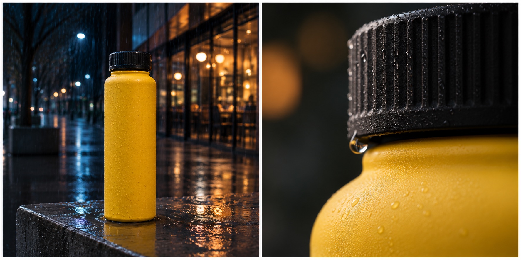
Photograph the yellow bottle on a wet concrete ledge at night. Cool ambient city light mixes with warm light from a shop window to the right. Subtle reflections on the damp surface, with enough light to recognise the bottle and its colour. No excessive lens flare or neon skyline.
10. Macro material detail
A close-up changes what someone notices. The whole product becomes less important than a seam, a texture or the way two materials meet.
Choose a detail that deserves the attention. For a real product, this is also where you need to check the result most closely: an invented seam or fastening can look entirely plausible.
Create an extreme close-up of the yellow bottle’s black cap seam and matte yellow surface, with a single small water droplet. Soft directional light and shallow depth of field, with the seam in sharp focus. Preserve the construction shown in the product reference.
Refine the picture, rather than rewriting the whole prompt
Once an image is close, give it a clear note. Treat the next instruction as feedback on a photograph.
Keep the product, framing and background unchanged. Move the light to the right and make the shadow harder.
Or:
Keep the lighting, but pull the camera back to show more of the courtyard. Leave the upper third clear for a headline.
Changing one thing at a time helps you see which decision improves the image. Check the whole frame afterwards, because an edit can also alter details you wanted to keep.
Camera language can help, but describe the effect you want as well. “A wide view that includes the surroundings” gives a clearer intention than a focal length alone. Likewise, if people appear in the scene, give them an action. Packing a bag or passing a bottle across a table gives you more to direct than “a person holding the product”.
Make the images feel like one campaign
Finding one strong image is a start. The next challenge is producing a set that belongs together.
Keep a short record of the decisions you’ve approved: palette, light direction, contrast, camera height, backgrounds and space for copy. Then try a wide scene, a closer product shot and a detail. They should feel related without looking identical.
Plan the placements too. A social portrait, a website banner and an outdoor poster give you different amounts of space. Build each composition around the idea rather than expecting one image to survive every crop.
For finished work, review product details against approved assets. Generated images can change packaging, interfaces and construction. Where exact accuracy matters, photography or compositing may be the better route. Our guide to what to shoot and what to generate looks at how to make that choice.
Taking the direction into film
A still can establish the look of a commercial, but it leaves the action unresolved. What happens next? Why does the camera move? How does this shot connect to the next one?
For the bottle, you might begin with a wide courtyard shot, have a hand enter to pick it up, then cut to the cap detail. Each image now has a role in a sequence.
Use the photographic direction to guide the film, then develop the performance, movement and edit around it. Review the finished work at the size people will see it, with the copy, sound and brand assets in place.
Choose the look that belongs to the brand
The point of exploring ten styles is to find a direction worth pursuing. Hard flash might give one launch the right attitude. Quiet daylight might make another product feel more desirable.
If you’re developing campaign stills or a commercial, bring us the brief and a few references. We can help turn them into a distinctive visual direction and decide where photography, AI or a combination of both will serve the idea best. Explore our AI and hybrid video production work for examples.
The visuals in this guide are AI-generated studies of a fictional product. They illustrate the different treatments; they are not client campaign photographs.