
AI video production in 2026: what changed in a year?

Revisiting an AI film a year later is a useful way to see what has actually moved on. Not the launch demos or the model names: the faces, the water, the light, and the small details that either sell a shot or pull you out of it.
For our 2025–2026 comparison, we returned to the Stratiphy creative. A man floats in an inflatable, a surfer shares a board with a dog, and a phone brings the product into the story. They are playful scenes, but they ask quite a lot when it comes to the craft of AI generation; people, animals, moving water and close interaction, all in the same film.
Watching the two versions, the biggest change is how much of the newer material feels photorealistic. Here is where that difference shows up, and what we would still look at closely before putting a shot into a finished advert.
Our Stratiphy 2025–2026 comparison
This was an ad campaign that Sidekick created and produced for Stratiphy to launch their AI-lead investment platform. Some compositions and performances have changed too, so this is a comparison of the finished creative rather than a like-for-like test of individual models. We're diving into the details with this one.
Character realism - Less illustration, more person
The face is usually where you decide whether to believe an image. In the earlier inflatable shots, our false protagonist has a very crisp, almost illustrated finish. The freckles, beard and skin detail compete for attention. In the newer treatment, the skin has gentler tonal variation and the hair feels less sculpted. There is still detail, but it sits more comfortably within the image.
The expression makes a difference as well. The newer character feels less posed, with a looser face and a more natural relationship to the inflatable. From a director’s point of view, that matters as much as a sharper texture. You want to read a person having a moment, without spending the shot inspecting their face.
Water - Depth, foam and a convincing surface
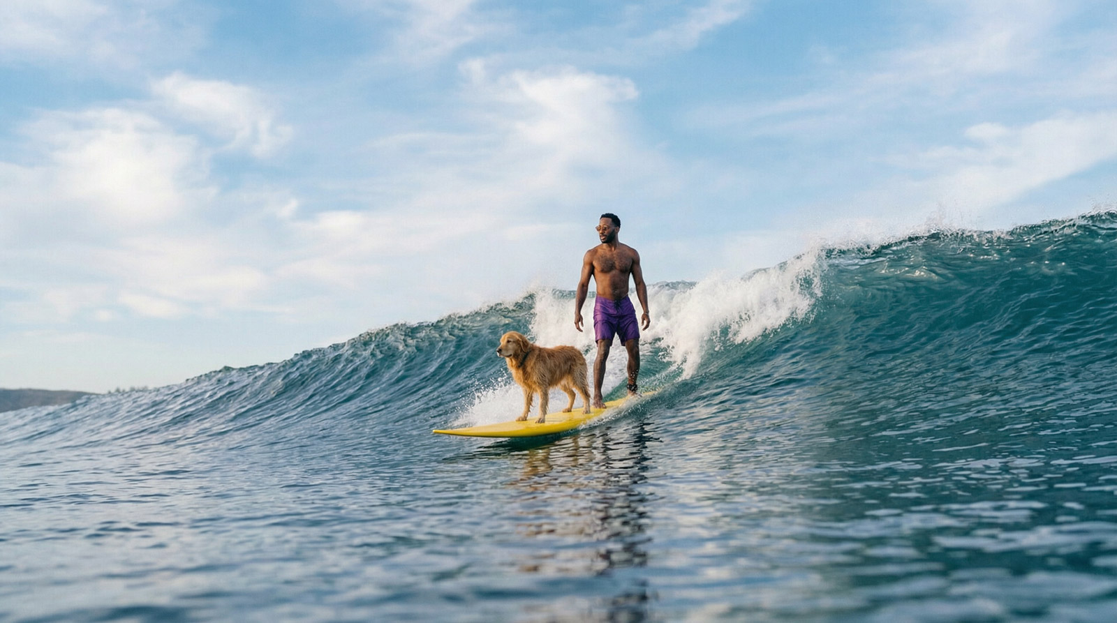
Water is a good stress test because there is so much happening at once. The surface catches the sky, the wave has volume, and the foam has to feel separate from the darker water underneath. Around the surfer and dog, the newer treatment gives those layers more distinction. The smaller surface ripples and the breaking water behind them help the ocean feel less like a dramatic backdrop.
The earlier surf scene has a very graphic quality: a large wall of water and hard, bright highlights. The newer scene feels more photographic, with a clearer separation between the board, the surrounding water and the wave. The warmer lighting contributes to that change, so it would be too simple to put it all down to water simulation.
In an edit, we would watch the contact points especially closely. Does the board sit on the surface? Does spray emerge from a believable place? Does the water carry on moving naturally as the subject moves? A beautiful crest is only part of the shot.
Lighting and colour - Making everything belong in the same scene
The newer surfing material has a warmer sunlight treatment. Skin, the dog’s coat and the yellow board pick up that warmth together, while the water keeps its cooler tones. That relationship helps the subjects feel as though they were photographed in the same place.
It is the sort of thing you would look for on a shoot: where the key light is coming from, how a face turns into shadow, and what the surroundings bounce back onto the subject. The newer images feel more cohesive in those relationships. Simply adding contrast or making every surface shine would not achieve the same result.
There is also a finishing decision here. Individual shots can look impressive and still fight each other in a sequence. Exposure, skin tone and colour need to carry through the cut, just as they would with footage from a camera.
Fabric, fur and small details - Texture with some restraint
The T-shirt in the inflatable scene is a useful detail. The newer version has softer folds and a more convincing sense of wet fabric against the body. In the earlier treatment, the shirt reads more as a clean white shape. Those little variations in material help give the character weight.
The dog presents a different challenge. Fur needs variation without turning into a mass of sharp strands, and it needs to keep its shape as the head and body move. The newer treatment feels more photographic, particularly where the coat catches the light. In the home scene, the wider framing also gives the man and dog more room to interact. That improvement comes partly from staging, as well as the rendering of the fur.
Camera and staging - A better image starts with a better shot
The two surf versions do not use the same pose. The earlier surfer crouches; the newer one stands more upright, with different framing around the dog and board. At home, the newer composition opens out. These choices affect how naturally a scene reads before you get into the finer image detail.
That is an encouraging part of revisiting the film. You can reconsider the shot itself: the distance from the subject, the silhouette, the eyeline and the space around an action. Better generation gives you more to work with, but somebody still has to decide where the camera belongs.
For an editor, the test is whether the shots cut together. A camera move needs somewhere useful to start and finish. A reaction needs enough time to register. A convincing frame that never gives you a usable cut point can still be a problem.
Hands and phone screens - Where finishing still earns its place
The phone close-up brings several difficult elements together: a hand around a device, reflections on the glass, an interface and action beyond it. It is exactly the kind of shot we would inspect frame by frame, even if the first impression is convincing.
For a fintech advert, the screen carries meaning. The chart, wording and numbers have to be right. We would plan an accurate screen replacement or another controlled finishing route wherever the interface needs to match approved artwork. A more realistic hand does not remove that requirement.
What has changed for production?
On this comparison, the clearest step forward is the overall photographic feel. Faces, materials and lighting work together more convincingly. There is more scope to concentrate on the shot and the performance, rather than having every surface announce how it was made.
The comparison does not tell us how many versions were generated or how long either film took to finish. Those are separate production questions. The useful measure is how much work it takes to get a shot that the director, editor and client can all use.
Our Stratiphy “Great Timing” advert shows why character consistency matters across a campaign. Our Sage mentor films put the emphasis elsewhere: recognisable branded characters and clear communication across English and French versions. Both need direction and a considered finish.
For a new brief, we would start with the hardest shot. It might be a person handling a product, a dog on moving water or a close-up of an approved interface. Test that before committing to the whole film. Our guide to what to shoot and what to generate explains how we make those decisions, and our AI TV advert cost guide looks at what they mean for the budget.
What we would take into 2027
As we plan the next year, the exciting part is having more believable material to direct and edit. The craft stays familiar: choose the right angle, find a performance, keep the light consistent and make the cut work.
Our 2025–2026 comparison makes a strong case for returning to an idea as the tools improve. The newer images feel closer to footage you would want to put in a film. The final judgement still happens on the timeline, when you see whether the scene holds your attention and tells the story.
Explore our AI video production work, or talk to us about your next film.


